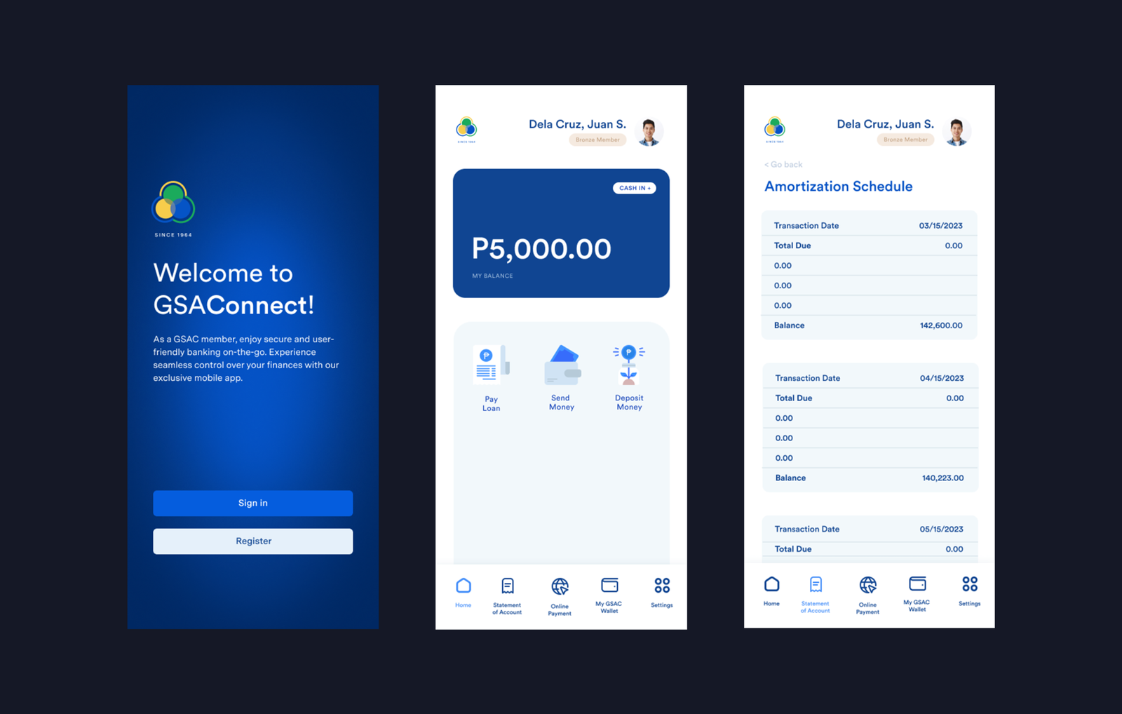
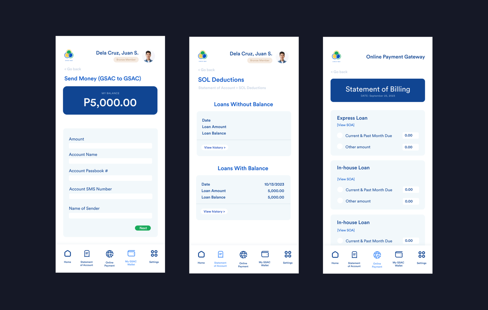
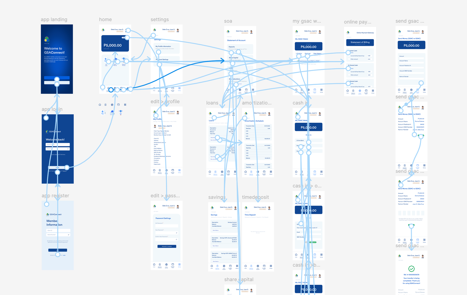
I led the UI/UX redesign of the GSAC mobile app to improve usability, visual clarity, and overall user experience. The goal was to transform the app into a more intuitive and reliable tool for GSAC members by addressing critical design and interaction issues.
PROBLEM SPACE
The original app design was created by outsourced developers and suffered from multiple usability problems. The interface used inconsistent and overwhelming colors, layouts were cramped, and several buttons lacked clear affordances or did not function as expected. These issues made basic banking tasks confusing and frustrating for users, reducing trust and engagement with the app.
SOLUTION
I redesigned the app with a strong focus on clarity, accessibility, and usability. This included simplifying the color system, improving spacing and layout hierarchy, and standardizing interactive components to ensure buttons and actions behaved consistently. The redesigned experience delivers a cleaner interface, smoother interactions, and a more user-friendly mobile banking experience aligned with GSAC’s needs and brand.