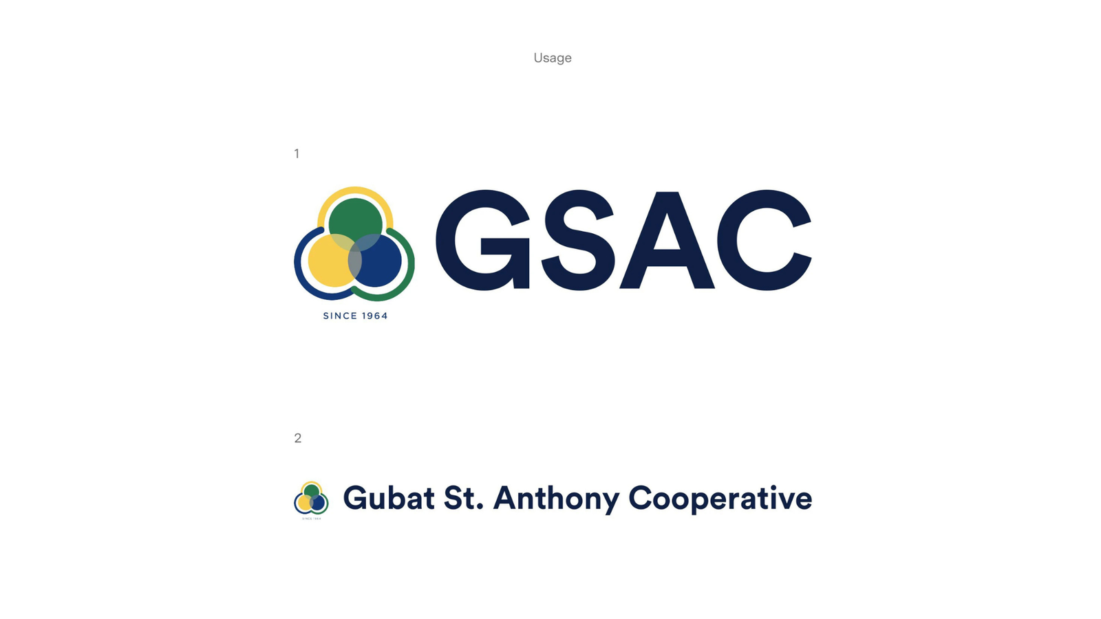
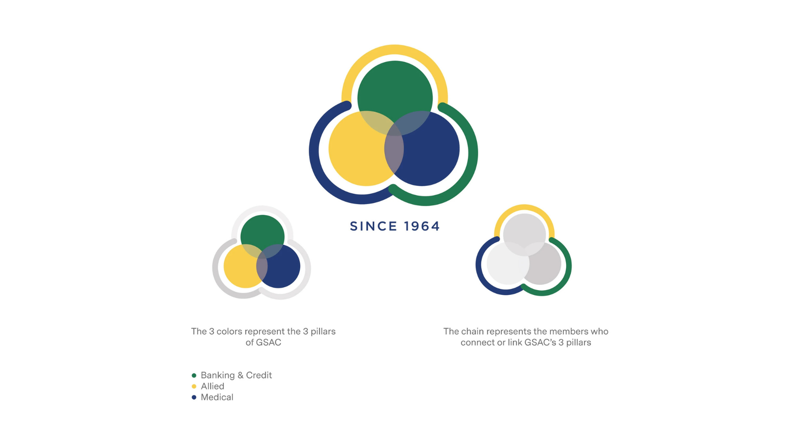
A complete brand identity refresh for GSAC, a financial services cooperative, designed to establish a more professional, trustworthy, and cohesive visual presence across digital and print touchpoints. The project included logo refinement, color standardization, brand guidelines, and a scalable design system to ensure consistency across all communications.
PROBLEM SPACE
GSAC's existing brand identity had evolved organically over time, resulting in inconsistent use of colors, typography, and visual elements across different materials.
The logo felt outdated, and the absence of a formal branding system made it difficult to maintain a cohesive and recognizable presence. As a financial institution where trust and credibility are essential, the fragmented visual identity no longer reflected the organization's professionalism or long-term vision.
SOLUTION
I developed a comprehensive branding system centered around a modernized visual identity that preserved GSAC's heritage while improving clarity and consistency. This included refining the logo, defining a unified color palette, establishing typography standards, and creating reusable brand assets and guidelines.
The resulting system provided a clear framework for future marketing, digital, and print materials, helping GSAC present a stronger, more professional, and more recognizable brand across all channels.